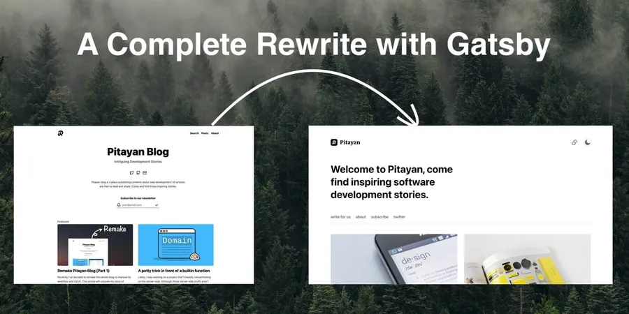
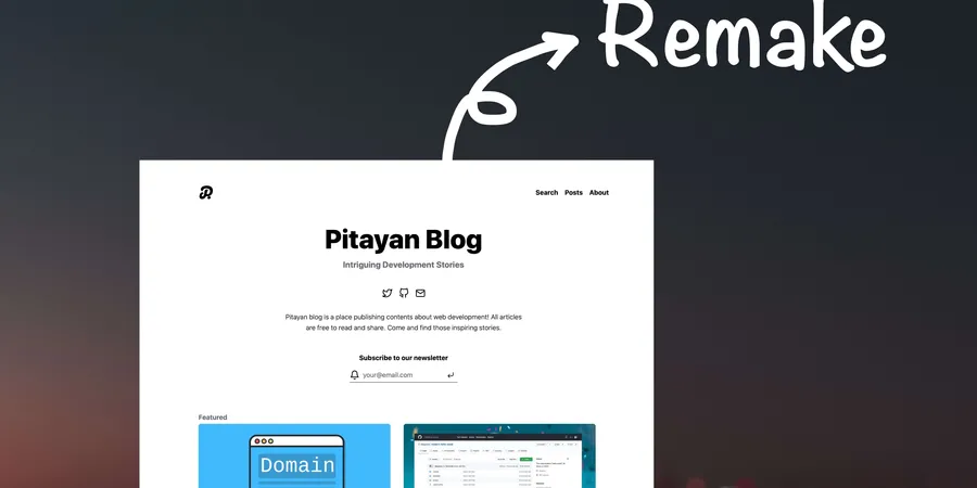
In 2021, I wrote an article of Remake Pitayan Blog (part 1) sharing an idea of re-constructing my blog with a better design. And finally at the same timing when this article was published, the project was initialized.
This project went quite a long way for over 10 months. I never thought this whole project would ever spend so much time to complete. As of this day when this article is written, Pitayan blog is officially updated to this new version.
# Setting up the objectives
I can only use my spare time on my personal projects. And almost all of my time were spent on function developments and fixing bugs. As a consequence, those intermittent contributions caused many back and forth due to lacking of appropriate objectives ahead of starting those projects.
Thus this time, I setup some practical objectives and list out the necessary “todos” under each of its items. I know that if I don’t keep a track on what to do and what has been done somewhere, then resuming the process of this project later after some break may become very problematic.
To begin with creating objectives, I wrote down some notes around the following aspects:
- The blog new UI design
- Implement the blog with Gatsby (as a plugin)
- Create necessary pages
- Migrate articles from the current blog
(And actually in the next following months, the development kept running toward that direction without any turnings.)
For managing objectives, I utilized Github “Projects” feature to help me manage issues and notes. As you could see there are still quite a few more tasks to do for this project. Although some of the tasks are not very fine-grained, they are yet helpful every time when I hope to recall the latest progress.

# Migrating from “Gridsome” to “Gatsby”
The previous article mentioned why to migrate away from Gridsome
I want to migrate to Gatsby for a bigger community.
It is a very interesting but a very time-consuming step to me. But I believe the outcome of this step will eventually turn out to be the right decision.
Gatsby provides a solid user guide that let me get started quickly without digging into their source code for solutions. And meanwhile, Gatsby’s rich plugin library helps extending the functions rather easily(even with only official plugins).
Since it’s a complete rewrite, I followed some example repos to scratch my own project. (Want to say thanks to these repo owners and contributors)
- gatsby-theme-novela (Unfortunately, the original repo was out of maintenance and removed by the owner. This is a fork)
- gatsby-starter-blog-dev-mdx
- gatsby-starter-tailwind-mdx-blog
- gatsby-mdx-blog-starter-project
These years, many CSS frameworks claims their helpful features are able to solve developers’ pain points. At first, frameworks using CSS-in-JS like styled-components & emotion were taken into consideration judging their community relativity toward React.js.
I started using Tailwindcss from long ago, and felt it extremely handy and flexible (maybe I’m just quite used to it already). So, in this project, I want to try with Tailwindcss again.
And for the core plugins, the following ones are chosen based upon the official starters. (Guess almost every developer would pick these up no matter what)
- gatsby-plugin-mdx: need to allow using React components in Markdown source for a quick feature enhancement
- gatsby-plugin-sharp: Image quality control
- gatsby-plugin-image: Provides the images component
- gatsby-remark-images: Process markdown images
- gatsby-transformer-yaml: Process Yaml file (used for author profile)
- gatsby-transformer-sharp: Image quality control for markdown images
- gatsby-source-filesystem: You know, the very necessary plugin…
Finally, with some extra “personal-favored” plugins, I created a rough repo outline. Check out to this commit 0d23f502cb2538e51e75ea7589b1ca53722c121f to see the beginning setup (Github link here).
# The UI design
The previous Pitayan blog design is very good-looking to me. Back then, it was made to mimic Medium.com and Dev Community to a certain extent (perhaps only the color schemes :p).
But frankly speaking, creating a new design out of the thin air is quite challenging to an engineer without much of design knowledge like me. Thus this time when I started working on the designs, I almost copied 100% of Novela’s layout but added some personal flavors to make the difference. Which the “difference” is actually to bring the previous designs like “page footer” & “post meta” etc to the new design.
I now have only one comment for this decision:
Experience is a reliable beacon.

I wanted to log all of those beautiful designs somewhere like a Github issue. I made one here but it’s a pity that the progress was never to date…
# Using Rotala.css?
I still remember my CSS project in 2019: Rotala.css which is used by the previous Pitayan blog. This little framework seems very handy at first because it provides lots of useful CSS definitions to extend upon, especially the typographical designs.
Here is example how I implemented the classes for the components.
Such implementation style is exactly what Rotala.css recommends (by using @apply keyword to mix classes).
.site-tag {
  @apply rounded-sm;
  @apply py-0.5 px-1;
  @apply text-sm;
  @apply text-gray-800;
  @apply bg-gray-200;
  @apply hover:bg-gray-300;
  @apply transition-colors;
  @apply duration-150;
  @apply ease-in-out;

  /* Dark Mode */
  @apply dark:hover:bg-gray-700;
  @apply dark:bg-gray-800;
  @apply dark:text-gray-400;
}
Although this is a really cool feature to reply upon, it seems Tailwindcss prefers users to handle their classes in the HTML template.
# Color Palette
The color of the new design is just the default setting of Tailwindcss. The default palette is already very eye-comfortable, thought it’d be not that necessary to change that so early.
500
500
500
500
500
500
500
500
By the way, changing the colors with Tailwindcss is just another piece of cake.
Overriding the theme settings in the tailwind.config.js will do the trick.
// tailwind.config.js
module.exports = {
  ...
  theme: {
    colors: {
      primary: {
        ...
      },
      red: {
        ...
      },
      green: {
        ...
      },
      ...
    }
  }
}
# Some cool features
# The selection popover menu
Medium has a popover menu displaying right above the text content you selected. When it pops up, you could highlight the text and add comments (and even share it to Twitter). Isn’t it a wonderful feature?

Such feature also exists in the Novela blog. It doesn’t support text highlight because it requires backend data. But instead, you could copy the selected text and share it to Twitter. So I decided to mimic the Novela’s selection popover feature. In this article, you might already noticed this feature but note that the only available area is this article content itself.
I referred to some community React libraries react-selection-popover & react-text-selection-popover. They offered great example of how to detect selection and calculate the positions. Anyhow in the end, I have to create my own plugin / hooks to introduce this feature into the blog theme.
The reason of doing this is pretty simple: neither of those 2 libraries work perfectly in my case.
In order to make it work as expected, I created a hook to meet my demands.
function useTextSelection (
  container: HTMLElement = document.body,
  offsetWidth = 0,
  offsetHeight = 0,
  lineHeightDelta = 32
): { left: number top: number textContent: string }
The function returns left top and textContent. To position the popover, just set the popover mask to absolute together with its left and top values.
<div className="selection-popover" style={{ left, top }}>
  ...
</div>
The container is the HTML element target that holds your selection content. It is a relative anchor of the selection popover container.
By default, the html•document.body should be a decent container. However usually, it’s depending on how you gonna define your popover component.
In my case, since the popover component has to stay as descendent of the markdown content(the MDX container), it’s better just to use that content tag as container.
offsetWidth and offsetHeight are used for centering the popover container. They don’t have to be static values as you could grab those attributes from the HTML tag typescript• const { width, height } = targetContainer.getBoundingClientRect().
In the short feature, I may create a new repo to make everyone accessible to this useful plugin. By far, the source code is also a good example I presume for those who wants to have a selection popover component in their page.
# Medium-like picture magnifier
There’s a ready-to-use library called medium-zoom that reproduced the feature of the Medium.com’s picture zoom-in. The time when I found it, it made me so happy that I don’t have to create a plugin myself to achieve the feature.
Guess there’s no need to talk more about this feature. Just feel the power of it by click the picture below (or any other pictures in the article page).

Amazing, isn’t it?
# Dark and light mode
Like some document sites such as vuejs.org, Pitayan.com now has supported dark-mode with the Tailwind’s builtin feature. It affects not only the usual components for site layout but also the code highlight.
Remember Tailwind’s dark variable? It is the key to making styles inverted under dark-mode.
@apply text-gray-800;

/** Dark Mode */
@apply dark:text-gray-400;
You may have noticed the “sun” icon ☀️ in the top navigation bar, it triggers the theme to toggle between light and dark. (Believe you’ll be enjoying using the dark-mode for protecting eyesight 🤓)
# @pitayan/gatsby-theme-pitayan
Now the Pitayan.com provides a Gatsby theme plugin so that everyone else can build their own Gatsby blog with our theme.
Check out this Github repo: Pitayan/gatsby-theme-pitayan.
Following a quick installation which is also mentioned in the README file. The sad part is that it’s only a plugin rather than a startup template. It still requires some more steps to get it to run locally.
$ npm install --save-dev gatsby @pitayan/gatsby-theme-pitayan react@17 react-dom@17
Besides, as you may noticed, at the moment it supports React 17 instead of 18 because the peerDependency of gatsby-plugin-mdx requires @mdx-js/mdx: ^1.0.0.
Let’s wait until they upgrade their version dependencies. Or maybe we could force using the latest React during NPM modules installation to circumvent the warnings.
# What’s next?
Finally, the new theme of Pitayan.com is released. Although there’re still some bugs within the theme, they’ll be fixed any day soon.
I think what’s more important to the site now is automate the release process.
Believe any day soon in the future, all I need to do for publishing a new article is just “write content” and “create PR”. And then it should merge the PR automatically by a Github scheduler.
Since the Pitayan.com deploys with Netlify, any commits to the master branch will trigger a new build.
I’ll be publising a part-3 to introduce this automation as the last step of the “remake”. Hope I could complete this as soon as possible (No more procrastinations 😆).
Thanks for reading!


